6 min read
Director’s cut
Breakmate, the long version
The evidence behind the problem, how we narrowed it, the calls we made and what each one cost, and what testing and an outside review changed.
Why it matters
Sounding supportive isn’t the same as helping
AI is very good at sounding like it cares. Our interviews, and the wider evidence, kept showing the gap between that and actually getting someone help.
OpenAI · October 2025
1M+
people a week have ChatGPT conversations showing signs of suicidal planning or intent, by OpenAI’s own estimate.
Wysa · 19,000 users · 2024
2.4%
of users in crisis called a helpline, even when the app kept encouraging it. Its AI had detected 82% of those crises.
UBC · 296 students · 2026
Only people
reduced loneliness over two weeks. Chatting with an AI did no better than journaling. Texting a stranger did.
Content note · crisis language
The conversation that started our pitch
A real, anonymized conversation from our research, described here rather than shown. The user was in crisis. The assistant misread it: it agreed where it should have questioned and filled in assumptions the user never made, even contradicting them about their own words. It sounded supportive the whole time.
We opened the pitch with it, behind a content warning, because it showed the failure more clearly than any statistic could.
What we heard
People feel the pull, and the gap
One job seeker turns to AI when her frustration peaks. She was surprised how well it mimics empathy, but uneasy knowing it’s a machine and unsure the relief lasts. She compared it to scrolling: something we do, but probably shouldn’t.
A human-factors specialist who uses AI deliberately said she likes it agreeing with her when she tests a simple idea, and prefers it handing her options over working through her own. Without it, she’d feel less capable. Nothing looks wrong, and the judgment still moves to the AI.
Another interviewee brings AI the worries that feel too small for his friends. But whenever a real person is available, a friend or therapy his insurance covers, he picks the person.
That last pattern set our direction. Breakmate doesn’t try to be a better listener. It points people toward someone who is.
The ambiguity
We didn’t start with “build an AI wellness app”
The brief was broad: how does conversational AI shape people’s judgment? My job was to turn that into a problem a four-person team could own.
v1 · Broad
How does AI shape judgment in uncertain moments?
Relationships, health, money, and everyday decisions. Too wide to design for.
v2 · Sharper
Frequent users seek relief from AI
Venting, validation, answers, and confiding. Reliance shifts from the person to the chatbot.
v3 · Final
Reassurance quietly replaces self-trust
Each confirmation from AI stands in for the user’s own judgment, and today’s tools can’t recognize the difference.

Our “how might we”
How might we help young adults who turn to AI during moments of uncertainty build trust in their own judgment?
Research
What we heard, and what it changed
Who we heard from
80%
use two or more AI assistants (8 of 10), so no single app sees the whole loop
70%
had used an AI chatbot for emotional support (7 of 10)
70%
use AI every day or more (7 of 10)
From our recruiting screener: 10 AI users who applied to be interviewed. We recruited people who use AI for personal support, so this describes them, not all AI users.
Insight 1
Repeat questions are the signal, not screen time
People brought AI the small, recurring worries they’d be embarrassed to share with friends. It’s free, instant, and “doesn’t need a background check.” The repetition, not the hours, is what signals reliance.
Insight 2
Detection isn’t the hard part. The hand-off is.
Even when a tool spots distress, very few people follow through to a human. The path to support has to be short and chosen by the user.
Insight 3
No single AI app sees the whole pattern
People split time across several assistants. Safeguards like ChatGPT’s trusted contact only see what happens inside ChatGPT.
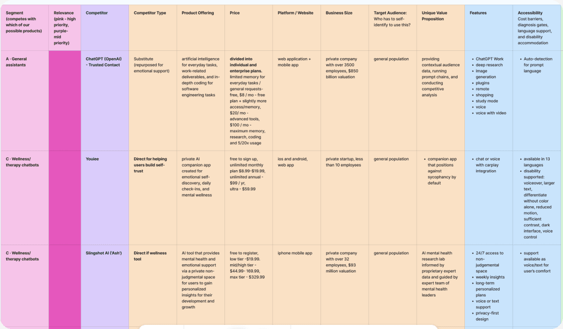
Competitive analysis of general assistants and wellness chatbots. The gap: nothing tracked patterns across tools or made the hand-off to a person easy.

Sketches by me and the team. Each of us sketched against our refined “How might we,” and ideas like a traffic-light signal and a conversation bridge fed the final concept.
More decisions
Three more calls, and what they cost
The main story keeps the three that shaped the product most. These shaped how it behaves.
The question
Step in automatically, or let the user decide?
We chose
User-set limits, plus a direct line to someone the user picks.
What we cut
Automatic blocking or escalation. It takes away the control we wanted to give back.
The question
How much conversation data do we need?
We chose
Pattern analysis on the device only; conversations are never stored; disconnect anytime.
What we cut
Cloud analysis of chat content. It might be more accurate, but it breaks trust. (Access to other apps’ data still needs to be validated.)
The question
Our Adobe advisor asked: how do we make relying less on AI actually stick?
We chose
A values quiz in onboarding, so nudges and exercises point back to what each person cares about.
What we cut
One set of tips for everyone. Advice that isn’t about you is easy to ignore.
What testing changed
Five fixes, screen by screen
Before

Mid-fidelity dashboard (v4): every metric and topic on one long screen.
After

Final dashboard: a positive-language summary first, then patterns by tool and the week’s wins.
Onboarding now says what Breakmate does up front
A tester got lost navigating because nothing explained the app’s purpose.
Selected states are more visible
Testers asked for active selections to be clearly visible.
The dashboard shows less at once
Testers liked the dashboard for accountability, but found too much on one page.
Back buttons moved below the Dynamic Island
Back-button icons overlapped the iPhone’s Dynamic Island.
Expert review · September 2026
An outside PM found four rough edges
After the program, a product manager who has worked on consumer AI products clicked through the prototype. I fixed what they caught in a working copy, so the version the team tested stays as it was. The prototype on this page includes the fixes.
Continue turns on when you’re ready
After picking tools and checking consent, Continue still looked disabled. It now turns active as soon as both are done.
No answer appears twice
One onboarding answer was listed twice. The repeat is now a new option, late-night overthinking.
Dismiss steps back
The brown Dismiss button competed with Try this. It’s plain text now, so the suggested action stays the clear next step.
One cue per topic card
“See insight” and the arrow did the same job. The label is gone, and the arrow and the whole card still open the insight.
Design system + accessibility
Designed end to end, for hard moments
I designed every screen of Breakmate. People open it when they’re stressed, often late at night, so accessibility was part of the system from the start, not a pass at the end.

What I designed
The full product
• All UI and interaction design, from lo-fi wireframes to the final prototype
• A 163-variable design system with light and dark modes
• The components, and the micro-animations testers praised
• Brand and logo by Chris Cornelious
Accessibility
What I built in
• Contrast checked on every screen
• Minimum text sizes, system-wide
• Tap targets of at least 44 points
• Dark mode for late-night use
• VoiceOver labels for every control
• Reduced-motion alternatives
• Back buttons below the island
Why it matters here
Stress is the use case
Small text and low contrast fail people first when they’re stressed or tired, so these were requirements, not polish.
Pitch day
What the room said
The capstone ended with a live pitch and demo at BRIDGEGOOD, closing out a UX Design Apprenticeship of more than 170 hours.

Accepting my certificate after the pitch.
Feedback
“Brilliant.”
From a cybersecurity professional in the audience, who also pointed to universities as the right way in, matching the institutional model we had proposed.
Our advisors from Microsoft and Adobe saw it helping a much wider range of people than students.
The values quiz, added after our Adobe advisor’s challenge, was the audience’s favorite part of the demo.

With my team, JMAC: Jaslyn Brown, Chris Cornelious and Annie Chan.

Working through the prototype together at BRIDGEGOOD.
What I learned
Two things I’ll carry forward
Research has to be the tiebreaker
Everyone arrived with a favorite solution, and some design calls turned into real conflict. What worked was making the research the referee: if a finding didn’t support an idea, it didn’t ship. I also learned to match work to people’s strengths and to check quality early, rather than step in once a deadline had slipped.
It isn’t a young-person problem
We scoped for young adults, but the pattern showed up across generations, rooted in loneliness, social skills, upbringing, emotional state and AI literacy. And a hand-off only works if the help on the other side is affordable and still there when the person comes back.
© 2026 Moe Htet
·
Updated September 2026
·
Los Angeles, 9:05 PM